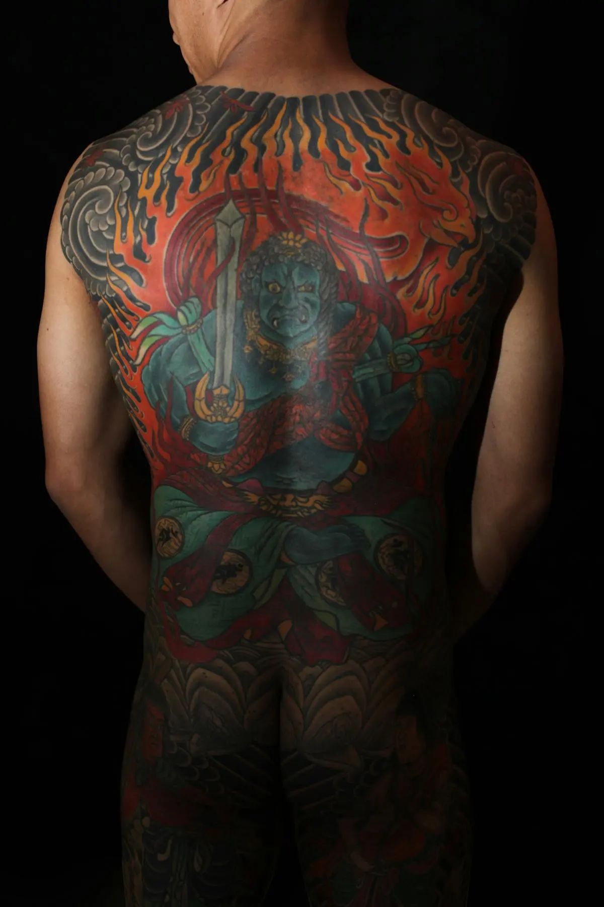
Japanese traditional tattooing, irezumi, is an architectural practice. The koi doesn't just go on your arm; it swims through a composition of waves, wind bars, and maple leaves that wraps your body with intentional flow. That relationship between subject and background is the defining visual signature: no element floats in empty space, and the negative skin acts as deliberate highlight and depth, not absence of design. Irezumi has been practiced in Japan since at least the Edo period (17th century), when decorative tattooing developed alongside woodblock print culture. Artists like Horitoshi and Horiyoshi III codified modern irezumi in the 20th century, drawing directly from ukiyo-e print traditions, which is why Japanese tattoos look like prints come to life. Technically, the style is demanding in two directions: the individual elements (a tiger's fur, a dragon's scales) require fine rendering, while the overall composition must work across large body areas as a cohesive whole. That makes irezumi one of the most complex styles to plan correctly. It reads well on all skin tones because it relies on bold, opaque color rather than subtle gradients: saturated reds, deep blues, and black anchor the design regardless of the skin underneath. Placement almost always means committing to a large-scale piece: a half sleeve at minimum, ideally a full sleeve or back piece, so the wind bar and water backgrounds have room to connect the composition properly.
Pick this style if...
- People committing to a large-scale piece or bodysuit
- Collectors who value historical lineage
- Work that will hold up at 20-foot viewing distance (bold lines, solid color)
Skip this style if...
- You want a small, standalone tattoo
- You want photographic realism
- You're uncomfortable with traditional motifs (yakuza/water imagery)
Notable artists
A starting point. Follow their work, don't just book the first DM-slot you can get.
- Horitomo
- Shige (Yellow Blaze)
- Chris Garver
- Horitaka
The rules of the style
- Large-scale composition: Japanese tattooing is architectural. Single motifs are designed to flow with the body; sleeves and backpieces use wind bars, waves, and clouds to connect elements.
- Specific motif vocabulary: koi, dragons (ryu), tigers, phoenixes (ho-oh), oni, peonies, chrysanthemums, maple leaves, cherry blossoms. Each carries symbolic meaning; mixing carelessly breaks the grammar.
- Subject + background always: the negative skin technique (leaving skin to create depth) or a filled background of clouds, water, or wind bars. Motifs floating on bare skin are a Western shortcut, not traditional.
- Softer outlines than American Traditional: still bold, but with more variation in line weight to create dimensionality and movement.
- Color used symbolically: red for energy and power, blue-black for water and shadow, yellow-gold for koi scales and flower centers. Colors have meaning, not just decoration.
- Designed for full coverage: even standalone pieces should be designed with eventual sleeve or suit expansion in mind. Good irezumi artists think in bodies, not patches.
Color palette
- Black
- Deep red
- Indigo blue
- Forest green
- Yellow-gold (secondary)
- Grey wash (secondary)
- Coral pink (secondary)
Neon, pastel, or watercolor-style color breaks the style. Japanese tattooing uses saturated, opaque pigment.
Aftercare for this style
Japanese (Irezumi) follows the same basic fresh-tattoo routine as other styles: follow your artist's instructions, keep the area clean, and protect the healed tattoo from UV exposure.